Zespół Szkół Centrum Kształcenia Rolniczego w Różańcu
About the project
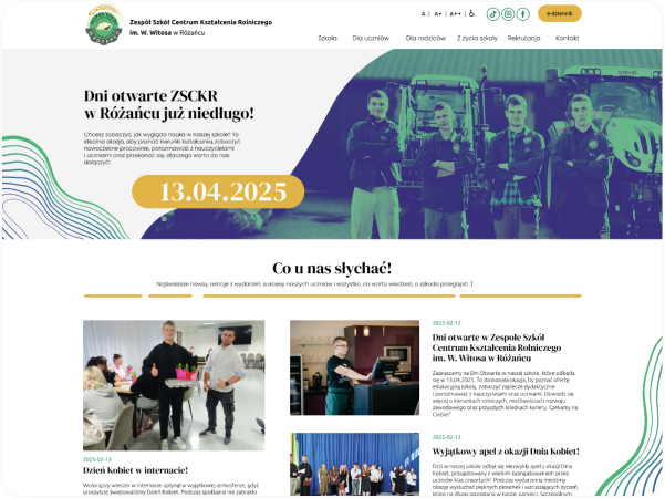
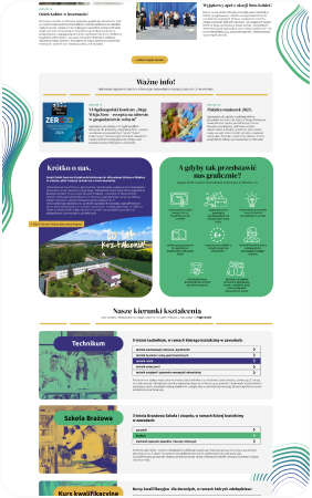
For the school we prepared a modern, vibrant yet balanced website. We wanted the site to be attractive and colorful for young people while keeping an aesthetic, orderly character. Apart from the website we also created a trifold promotional leaflet for the institution. It was a demanding project with a large amount of materials, but the final result brought us enormous satisfaction.
Scope of our work:
- We redrew the logo as a vector.
- We defined the colors and typography.
- We gave the communication a youthful tone.
- We designed a trifold promotional leaflet.
- We designed and implemented the homepage and subpages of the website.
- We connected social media, migrated content from the old website and handed over our original admin panel.
- We implemented the WCAG standard, a secure SSL certificate and installed the website on the target server.
The logo and improving its quality
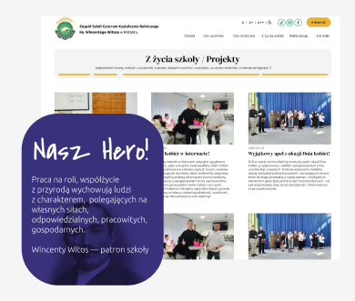
Our work on the logo for the school in Rozaniec was based on precisely redrawing the existing mark as a vector. For years the institution had used its recognizable symbol, but only had a raster (bitmap) file in very low resolution.
Converting the logo into vector form not only significantly improved its aesthetics and sharpness, but above all made it effortless to use in print. Vector files retain perfect quality regardless of project scale, from small gadgets to large-format banners.
We prepared the logo as a complete implementation package: in vector formats (ready for print and scaling without quality loss) and raster formats (JPG and transparent PNG).


Colors and typography
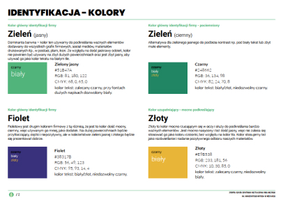
We built the color palette on vivid yet balanced shades that reflect the school's agricultural character and give it a modern look:
- Fresh green (#51B47A) and deep green (#248662): the brand's main colors referring to nature, agriculture and growth. Light green plays the role of a friendly dominant in graphic elements, while its darker shade provides ideal contrast for text.
- Accentuating violet (#38317B): a darker, deep shade added as a complementary color that brings contrast, elegance and modernity to the identity.
- Illuminating gold (#E9B538): a saturated color used to highlight key slogans, buttons and to brighten promotional materials.
- Neutral backgrounds and type (#F3F4F3 and black): a gentle gray serving as a calming section background and deep black guaranteeing ideal readability of published content.
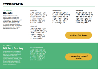
For text setting we chose a legible, modern set of typefaces full of character:
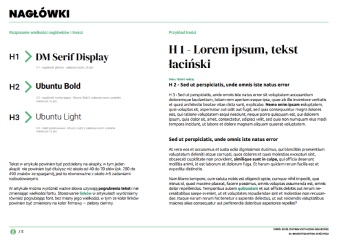
- Main headlines (DM Serif Display): an elegant classic serif font used in main titles (H1). It lends communication dignity and prestige of craftsmanship.
- Body and highlights (Ubuntu): a sans-serif, extremely legible and friendly type family (Bold for H2 headlines and Light for H3 body text). It keeps reception light on computer and mobile screens and fits the youthful tone of communication perfectly.
ZSCKR communication
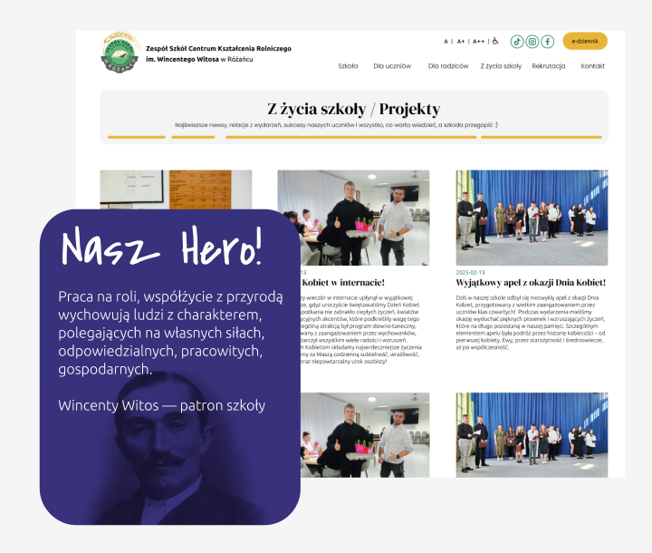
The main challenge in creating the tone of communication was changing the previous, very official style into a language that speaks directly to eighth-graders facing the choice of secondary school, so we changed our approach and added to the content:
- Lightness with a wink. We moved away from a stiff, official tone toward fresh, direct communication. Headline copy was written with light humor and a teasing character that breaks distance and builds positive emotions around the school.
- The language of benefits for young people. Instead of operating solely with a dry curriculum list, we focused on what really interests young people: atmosphere, the practical dimension of learning, passions and prospects after graduation.
- Clarity and balance. We kept the ideal balance: the language is casual and attractive for students, but at the same time dictated by respect and legible for parents seeking reliable information about their children's education, and with expressions of respect for teachers.
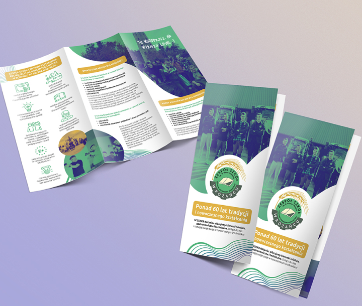
Print design - trifold promotional leaflet
In parallel with work on the website we developed promotional print materials. We designed a trifold leaflet (a recruitment folder) for the school's needs during education fairs, visits to primary schools and meetings with eighth-graders.
- The leaflet was designed using the same set of colors and typefaces, gentle, rounded graphic motifs as the new website. Thanks to this, a prospective student moving from the leaflet to the website immediately feels they are dealing with the same modern form of message.
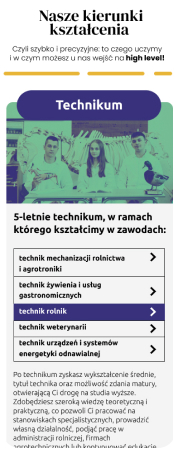
- We used a youthful tone of communication (“Take it to the next level :)”) and a clear section division. The layout in rounded modules allowed the rich offer of study programs to be presented in a light and attractive way and showed the institution's real strengths.
- We carried out the full print file preparation process, from CMYK palette optimization, through setting appropriate bleeds and cut lines, to professional processing of photographic materials. We handed the school ready, production print files, which guaranteed trouble-free printing.
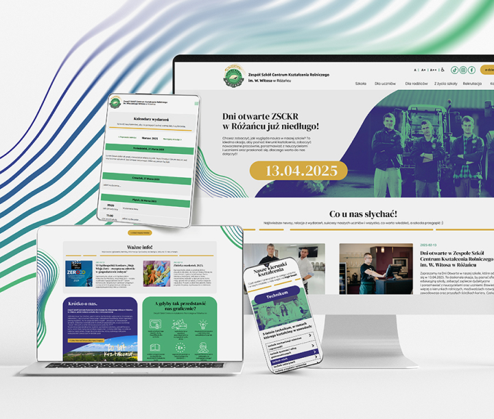
Designing and implementing the website
Creating the website for the School in Rozaniec was not just desk work. We cared about fully understanding the institution's character, so we based the design process on a close relationship and constant contact with the school team, especially Principal Renata Majewska - which we recall with great fondness to this day (may there be as many such clients as possible!).
The implementation happened without rigid barriers; we discussed and refined details also during phone calls. Thanks to this we could feel the true atmosphere of the place and transfer it into the digital world.
On this basis we designed a clear information architecture with an intuitive division into zones for students, parents and teachers, which made it easy to organize the huge amount of school materials. We crowned it all by writing clean code, migrating existing content, connecting an SSL certificate and efficiently launching the new website on the server.
WCAG standard, SSL security and server deployment
For an educational institution's website, the priority was not only attractive design but also full digital accessibility and security. Therefore the necessary legal elements of implementation were:
- Accessibility and WCAG standards: we made sure the website meets web content accessibility guidelines. Appropriate contrasts, legible typefaces, logical headline structure and optimization for screen readers made the website fully accessible and comfortable for all users, including people with disabilities.
- SSL certificate and security: we installed and configured an SSL certificate, ensuring full data encryption and a secure connection.
Finally, we launched the website on the server. We took care of full loading speed optimization, correct redirects and stable operation from the first day after publication.
We sincerely thank the entire team of the Zespół Szkół Centrum Kształcenia Rolniczego in Rozaniec, especially Principal Renata Majewska, for their trust, extraordinary hospitality, openness to our ideas and the delightful atmosphere during every meeting. Working on projects for such engaged and warm people is a true pleasure and a reason for pride.
We wish the school continuous growth, many wonderful successes and more generations of passionate students!
c o n t a c t u s
Ready for change? Let's start
working together.
Looking for someone to efficiently organize your company and give it meaning, color and expression? Someone who will showcase it online with a website or build a store that not only sells your products but also shows their character and your way of working? Get in touch. A conversation is the first step to change.
OFFICE & DESIGN
Your new website is just the beginning. See how to automate everyday business processes in your company and save hours of work every day.
» Process automationc o n t a c tu s
Ready for change? Let's start working together.
Looking for someone to efficiently organize your company and give it meaning, color and expression? Someone who will showcase it online with a website or build a store that not only sells your products but also shows their character and your way of working? Get in touch. A conversation is the first step to change.
Your new website is just the beginning. See how to automate everyday business processes in your company and save hours of work every day.
Connecting social media and original admin panel.
We integrated the website with the school's social media channels, which facilitated ongoing communication with students and building an engaged community around the institution.
The key element of the implementation, however, was handing over an intuitive admin panel. A school is a living organism in which content, lesson plans and announcements change very dynamically. So we built a panel that gives access to practically every corner of the website. Although it is extremely extensive in editing capabilities, we made sure it remains clear, simple and convenient for everyday use, so that staff can efficiently update information without technical knowledge.